PORTRAITS
The Charred Chairs of the Art World’s Biggest Bad Boy
by Jill Blackford
for Nikki Style Magazine
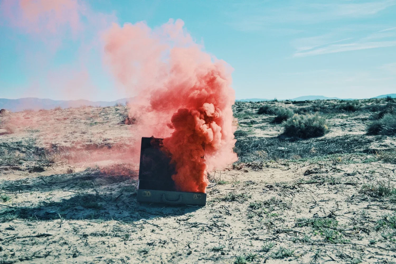
It’s an undercurrent of transformation that gives Baas’ work cohesiveness. Perhaps his most famous example: burning other designers' works to create a charred version of the original (yes, really). The ‘Smoke’ series hinges on perfect imperfection—and earned Baas the unofficial title of resident design-world bad boy.
//
For many designers, craft is being abandoned for the commercial. And that often leads to a forced marriage with sleekness and flawlessness. In Maarten Baas’ designs, there remains an allegiance to an uncommon definition of perfection.
“If we describe perfection or imperfection, we often call symmetry, smoothness, strength, shine as perfect. We call nature perfect, yet it would be very strange to see a perfectly smooth, symmetrical mountain landscape, for instance,” says Baas. “Maybe both ways are true, but sometimes I'm shocked by how many designs still relate to that ‘symmetry and shine’ way of beauty. So I sometimes mix up the fixed ideas about beauty, because they're so rational. If we would play music like we design, I think we would have a lot of synthesizer greatest hits. So maybe I sometimes just play some honky-tonk music, which you can't place in first sight, but is not necessarily ugly.”
That notion of ugly as beautiful—in large part in its freshness—is a theme in the Dutch designer’s work. His “Hey chair, be a bookshelf!” series makes beautiful the discarded remnants of someone else’s past. Various styles of second-hand chairs stack into an unconventional, but endearingly functional, bookshelf. But it’s the undercurrent of transformation that gives Baas’ work cohesiveness. Perhaps his most famous example: burning other designers' works to create a same-but-different version of the original. This ‘Smoke’ series was Baas’ graduation project at Design Academy Eindhoven, and it brought much attention—and the unofficial title of resident design-world bad boy.
“If we describe perfection or imperfection, we often call symmetry, smoothness, strength, shine as perfect ... So I sometimes mix up the fixed ideas about beauty.”
“[That label] is totally fine to me, as I think it's meant in a positive way,” Baas says. “Though I don't see myself like that. I'm not ‘anti’ anything. Terms like ‘enfant terrible’ suggest somebody who kicks against anything regardless what it is. I always work from a positive perception; I want to make certain things in which I truly believe.”
His newest installation, appropriately titled ‘Transformation,’ continues the surprise of evolution. Elm and camphor-wood furniture pieces seem to dissolve into pools of mahogany, testing our perception of what’s possible.
The inspiration for the work came while Baas was a resident in Shanghai-based Contrast gallery’s residency program. And the undercurrent of contradiction in his own work resonated with the same element of contrast in the city. His time in Shanghai exposed Baas to, as he calls it, “old/new, high-tech/low-tech, tradition/revolution, fake/real, cheap/expensive, original/copy, etc.” His Plastic Chair in Wood piece is an accessible result of that encounter, creating a link between mass production and hand carving, plastic and elm wood. Our notions of "high art, no art" are questioned in the process, right in line with Contrasts own philosophy.
“The gallery’s mission is to exaggerate differences,” says Contrasts founder and design visionary, Pearl Lam. “There are enough galleries in the world that show mainstream works that use aluminum or high-tech materials. We seek to explore how a young designer like Maarten Baas integrates the old and new with different techniques, as the world is moving away from craft. His work both seeks harmony and responds to the friction between the past and present to create a new visual language.”
“Dubbed artworld badboy, Baas burns iconic works to create a contradictory version of the original.”
Baas' strength is that he manages to make us comfortable with keeping friction at the forefront instead of smoothing it over, and we embrace his incongruous combinations instead of bracing ourselves against them. Where do Baas and Lam see this fitting within the themes in design today? Neither will say; they don’t like labels.
True to this aversion, Baas abandons the trends within his own work with his ‘The Chankley Bore’ series for Established & Sons. Displayed this year in Milan, it is an alien chair tribute—and with vivid preschool colors, it becomes Baas most obviously playful series.
At Design Miami, Contrasts will show stages one and two of Baas Transformation pieces. When asked what can be expected at this year’s fair, Baas emphasizes his desire that the fair stays a place where artists aren’t expected to debut new work, as in Milan and other fairs.
“Well, as I said, I'm not interested in themes, and I hope Design Miami isn't seen as something in which new themes should be unveiled,” says Baas. “There won't be new works from me in Miami. I make the things in my own speed, and only Milan is for me a certain update-moment in which I show my new pieces. The rest of the year I just show whenever something needs to be finished, but not necessarily during those fairs. I think the quality of work will get worse in general if all those moments will be used as moments in which something new needs to be presented. The good thing, so far, of Miami and Basel is that the quality is high because there's no media pressure to make something new every year.”
Although for Baas, creating new attention-drawing pieces—and stunning variations on the old—seems to come as easily for him as making incongruity perfect.